In the world of fiber optic network management, staying ahead of the game is crucial. That’s why we’re excited to introduce several feature improvements that will revolutionize the way you visualize your network data. From a new Network Dashboard for real-time analytics to dynamic icon scaling and threshold-based styling, these advancements will empower you to make more informed decisions and streamline your network management processes. Let’s dive in!
Network Dashboard: Summary Information for Improved Collaboration and Network Visibility at a Glance
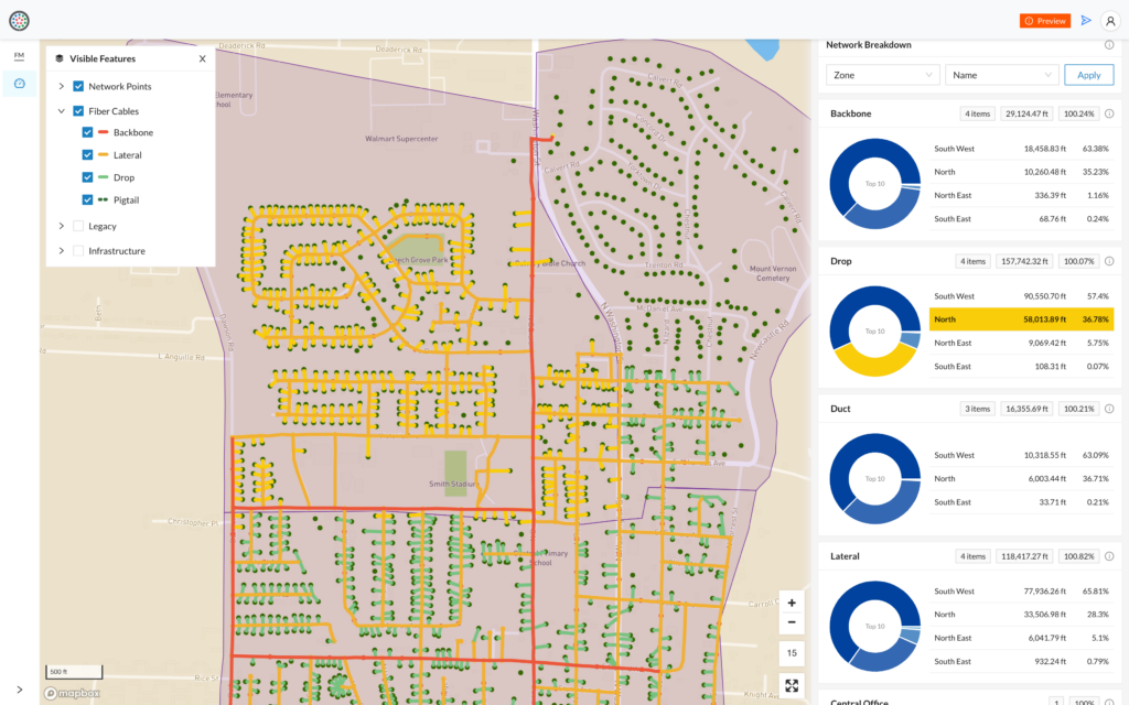
We’re particularly excited to introduce a new Network Dashboard application. With this new tool, accessing and sharing summary statistics of vital network elements is now effortless. The Network Dashboard provides:
Enhanced planning with comprehensive metrics.
With the Network Dashboard, you gain access to essential metrics such as the total number of network elements, miles of fiber cable planned or built, and the number of service locations to be served. These valuable insights facilitate accurate cost forecasting and ensure adequate resource allocation for future projects, empowering efficient planning and design processes.
Accessible data for seamless operations.
Enjoy the convenience of a shareable link for easy access to network stats and a mobile-friendly design optimized for field use on smaller screens. With the Network Dashboard, exporting data becomes less necessary as the summary statistics provided offer immediate answers to many network-related inquiries. Save time, streamline operations, and make informed decisions effortlessly.
Real-time monitoring of network growth.
This powerful tool keeps you informed as new assets are added or decommissioned, ensuring that the dashboard always reflects the current state of your network. This up-to-date visibility helps you to make efficient and timely decisions when it comes to network expansion or fiber overbuild progress. Stay in control and optimize your network with confidence.
Streamlined insights for executive management.
The Network Dashboard provides consistent visibility into key network elements required for quick decision-making. Summary statistics are updated in real-time ensuring that information is always up-to-date, even for users who may not be active in the VETRO FiberMap platform regularly.
Performance & Styling Enhancements
Dynamic Data Visualization for Different Zoom Levels
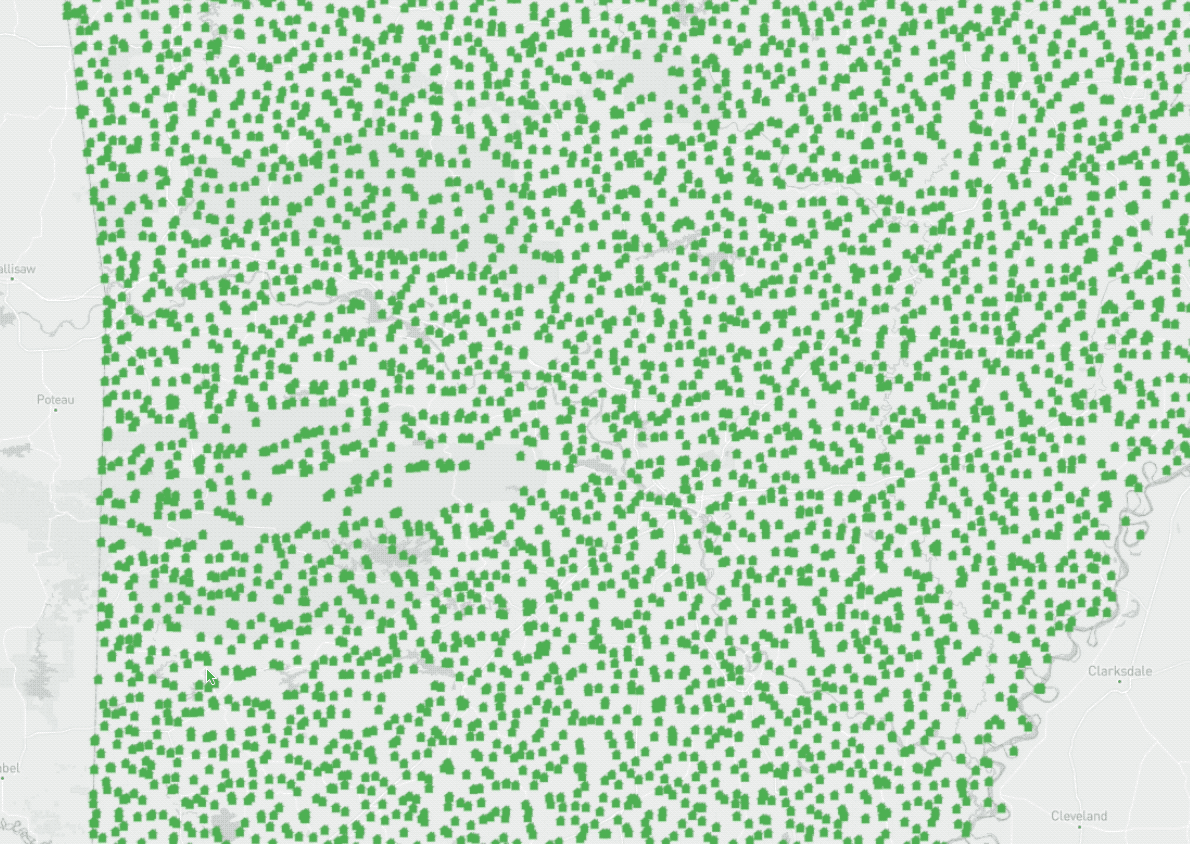
Icon scaling takes visualization capabilities to the next level by providing dynamic control over icon sizes at different zoom levels. This means that as you zoom in for a closer look, the icon sizes of network nodes and connection points will adjust accordingly, revealing more detailed information. On the other hand, zooming out will reduce icon sizes, giving you a clutter-free overview of your network. With improved readability and clarity, high-density network regions become more manageable, ensuring that crucial details are never lost. Icon scaling enables more effective analysis and planning, ultimately making your network management more efficient and informed.
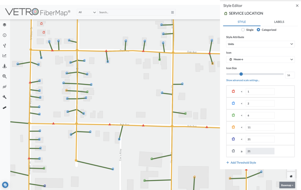
Transforming Numerical Data into Visual Indicators
VETRO now offers threshold-based styling to address the challenge of understanding complex numerical data. By visually categorizing data based on specific numeric ranges, you can assign symbols, icon sizes, line widths, and colors to different attributes. For example, you can customize the appearance of fiber cables based on their length or differentiate service locations by the number of units they serve. This transformation of raw numeric data into visual cues makes it significantly easier to grasp the structure and performance of your network. Threshold-based styling enhances your understanding of the current network state and aids in planning for future expansions and optimizations.
High-Performance Visualization of High-Density Networks
Visualizing extensive point datasets in high-density networks can be a challenge, especially at low zoom levels. However, with the circle display at low zoom levels feature, clarity and high-performance visualization are now within your reach. By disabling geometry simplification, this feature ensures that every point in your network is displayed with precision and efficiency, even when viewed from a zoomed-out perspective. Say goodbye to clustered icons and hello to clear and insightful visuals, allowing you to assess the state of your network effortlessly.
Stay tuned for additional feature releases and visit our Help Center for more information.
About VETRO
VETRO builds software that makes it radically simpler and faster for broadband providers to plan, design, build, and operate their fiber optic networks. Our map-based SaaS platform is easier to use and more powerful than traditional tools, and enables network owners, operators and sponsors to benefit from a modern, integrated, and connected digital hub for their physical network assets.